
In short
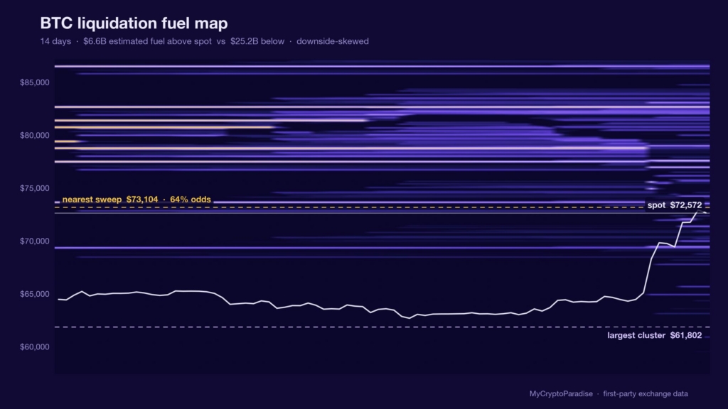
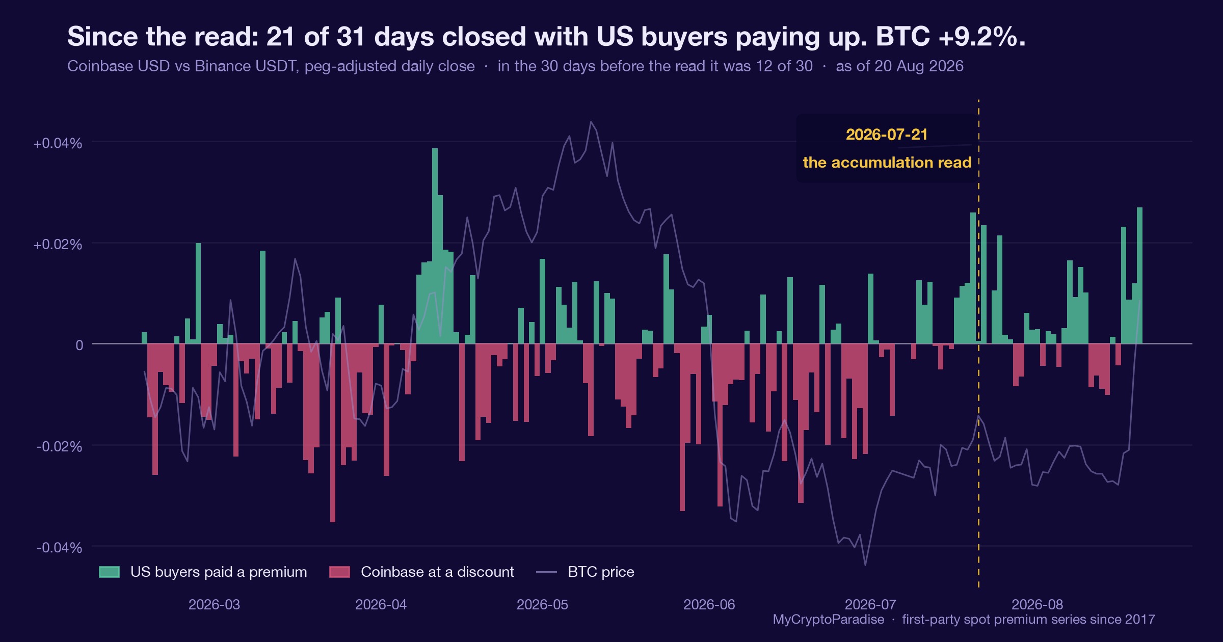
On 21 July 2026 Bitcoin squeezed to $66,900 and the move liquidated about $217M of positions within hours, most of it shorts. Our read that day was cautious: open leverage sat 6.7 times heavier on the long side, and the fuel map showed nearly twice as much liquidation fuel below spot as above. We leaned defensive. A month later the honest grade is that the alternative scenario ran instead: price ground up into the thin side of the map and sits near $72,572, up roughly 10%. We publish that miss rather than bury it, because the other half of the read did not resolve. It deepened: the fuel imbalance has moved from minus 31 to minus 59, with $25.2B now parked below spot against $6.6B above. This piece shows you how to read a liquidation fuel map, what a squeeze actually is, and what an honestly graded miss teaches that a highlight reel cannot.
What a liquidation fuel map actually shows
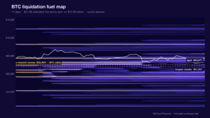
Every leveraged position has a price at which the exchange force-closes it. Stack millions of those liquidation prices into bands and you get the fuel map: an estimate of where forced buying and selling is parked.
Fuel does not start moves. It feeds moves that have already started, which is why the honest language is gravity, not magnetism.
A move into a heavy band accelerates as it forces closures. A move into a thin band travels on ordinary supply and demand.
That distinction is the whole craft of reading the map, and it is also where our July read went wrong, as we will grade below.
The 21 July squeeze, anatomised
The push to $66,900 was short-covering, not fresh conviction. Per the MCP Insider feed it triggered about $217M in liquidations within hours, inside roughly $426M across crypto in 24 hours.
Who paid tells you what happened. Shorts were forced to buy back, which is what propelled the move; by the time it stalled, spot had already slipped back to $65,896.
What remained was the imbalance: about $10.19B of open long leverage against $1.52B short, roughly 6.7 to 1. The squeeze cleared shorts and left the crowd leaning one way.
Under that crowd, the fuel map showed $19.87B of estimated fuel below spot against $10.56B above: an imbalance our data graded at minus 31, downside-skewed.
What is different here
The ParadiseTeam grades its reads in public, including the ones that miss. A feed that only ever revisits its wins is telling you about its editing, not its process. The miss below is left standing exactly as published, next to what actually happened.
The honest grade: the alternative ran
Our primary read was defensive: crowded longs above downside-skewed fuel in a fear regime argued risk-off over chasing. We claimed no historical frequency, because the base rates were not wired, and said the lean rested on live data.
The alternative scenario we published alongside it read: the crowded longs hold, price grinds into the thinner fuel above, and the squeeze extends higher.
That is the one that happened. Bitcoin sits near $72,572 as this update goes out, up roughly 10% from the read, having climbed straight into the thin side of the map.
And here is why the grade is worth publishing rather than deleting: the condition we flagged never resolved. It got heavier. The fuel imbalance has deepened from minus 31 to minus 59, with $25.2B of estimated fuel now below spot against $6.6B above.
A defensive lean that misses direction while its structural warning compounds is not vindicated, and it is not refuted either. It is a live tension, and pretending otherwise in either direction would be marketing.
Reading a fuel map yourself, step by step
- Read the imbalance first: how much estimated fuel sits above spot versus below, and which way it leans.
- Ask who is crowded. A 6.7 to 1 long-to-short ratio tells you which side pays if the map starts working.
- Treat clusters as gravity, not destiny. Fuel feeds moves that start; it does not start them.
- Cross-read the squeeze gauge. Heavy fuel with an unstretched crowd can sit untouched for weeks.
- Write both scenarios down before the market picks one, and grade yourself against what you wrote.
You can watch the live map on our crypto liquidation heatmap, the leverage picture on open interest, and sentiment on the Crypto Fear and Greed Index.
Act and invalidate, updated
| Scenario | What confirms it | What kills it |
|---|---|---|
| The grind higher extends | Price keeps travelling the thin upper bands while the crowd stays unforced | A rejection that starts feeding on the $25.2B below |
| The heavy side finally works | A move lower accelerating through the downside clusters | The imbalance unwinding upward out of its minus 59 reading |
| Nothing resolves | Spot ranges while fuel rebuilds on both sides | Either cluster getting swept |
Posture: unchanged in kind, humbler in confidence. A crowd this long above fuel this skewed still argues for defined risk over conviction, and the highest-probability trade for most remains no trade. New to leverage mechanics? Start with MCP University, and the full positioning picture sits on the MCP Insights hub.
Frequently asked questions
What is a liquidation fuel map?
It is an estimate of where leveraged positions get force-closed, stacked into price bands. Heavy bands mark where a moving price would trigger cascades of forced buying or selling. The map describes conditions; it does not predict which way price will travel.
What is a short squeeze in practice?
A rising price forces short positions to buy back, and that forced buying pushes price further up. The 21 July 2026 move to $66,900 liquidated about $217M this way. Squeezes reveal who was crowded; they do not by themselves establish a trend.
Does downside-skewed fuel mean price will fall?
No, and our graded July read is the demonstration. The map was downside-skewed at minus 31 and price rose about 10% into the thin side anyway. Fuel feeds moves that start rather than starting them, which is why we pair the map with positioning and sentiment gauges.
Why publish a read that missed?
Because grading reads in public, misses included, is the only way a probabilistic process can be audited. The miss also carries information: the structural condition it flagged did not resolve, it deepened to minus 59, which keeps the risk framing alive even though direction went the other way.
Where can I track the liquidation map live?
Our crypto liquidation heatmap renders the fuel bands, the above-versus-below split and the sweep odds from our own first-party exchange data, updated through the session. Open interest and the squeeze gauge sit alongside it in MCP Insights.
Crypto trading involves substantial risk and is not suitable for everyone. Nothing here is financial advice; it is education only. Never risk more than you can afford to lose.
The private Extras feed, where the fuel map, squeeze gauge and positioning reads update intraday with their invalidation levels attached, is part of PRO Paradiser, the intelligence layer behind the ParadiseFamilyVIP strategies.















Join the discussion
No comments yet. Pro Paradiser members, share how you are reading this.